In this video I explain the difference between histograms and bar charts, look at the creation of histograms and frequency polygons for continuous variables, and then discuss why we want to get a sense of the shape of a distribution of scores in order to compare it to a known distribution such as a normal distribution.
Video Transcript:
Hi I’m Michael Corayer and this is Psych Exam Review. In this video we’re going to look at how we can use histograms and frequency polygons in order to get a sense of the distribution of a set of scores in a sample.
A histogram is a visual representation of the frequency of different score values for a particular variable. So on the y-axis we’re going to have the frequency and then on the x-axis we’re going to have the different possible score values for that variable. Now it’s important to note that a histogram is for a continuous variable. If we have a variable that’s not continuous like a discrete variable or a categorical variable then in that case we don’t want to use a histogram. Instead we want to use a bar chart.
Now these can look similar and they can both be used to show the frequency of different score values but the distinction is that in a bar chart we have spaces between the bars, and what those spaces are indicating is that it’s not possible to have a score in that particular space. So the score falls into one bar for a particular category or it falls into a bar for another category, but it can’t fall in the space in between those.
Whereas in a histogram because we’re thinking about a continuous variable, we need to have a smooth transition across all the possible values for the variable and that means that all the bars have to be right next to each other. We can’t have any spaces or gaps where a score value isn’t possible. Now we might appear to have some gaps if we have a frequency at zero but we still technically have a bar there, it’s just that it’s at zero. So it’s indicating that in our sample we didn’t have any scores in that particular range but that they are possible. Whereas in a bar chart the separation is indicating that we can’t have scores in between those categories or in between those discrete measurements.
So the first thing that we have to think about with a histogram is making sure that we have a continuous variable. And then, because continuous variables have an infinite range of possible values, we could carry them to infinite decimal places, we’d have to think how we’re going to group scores together, because we necessarily have to group scores together, because we can’t have an infinite number of bars in our histogram. So each bar is going to have to represent multiple score values. So we have to decide how wide should each bar be. How many scores will we put together and say these all count has the same frequency? And this is where we’re going to cut off and say okay now it moves into the next bar.
So this is just like we did for a grouped frequency distribution table. In that case we had to create our class intervals and then we had to make sure that they were all the same size and that they smoothly transitioned from one to the next without any gaps. That’s exactly what we’re doing in a histogram but now we’re going to refer to it as the bin size. So we’re going to say that each range of values is a bin and then scores fall into that bin, or as soon as they’re a bit larger they fall into the next bin, or the next bin, or the next bin.
Ok, so there’s no spaces between any of the bins and the bins need to cover the full range of possible values for the variable. This means that all the same considerations that we had when we thought about class intervals will apply to the bin size in a histogram and as we change the bin size this is going to change the appearance of the histogram.
The only major exception is that in the case of bins we could have more of them than we might have had rows in a grouped frequency distribution table. In that case we said you probably don’t want to have more than about 15 rows because the table just gets hard to read; it’s just too much there. Whereas in a histogram, because it’s more visual, we might choose to have more bins than we would have rows in a table. We might decide that we can handle 25 or 30 bins in our histogram when we wouldn’t want to have a table with 30 rows; that would just be too much. But otherwise the same things basically apply, and we can think about how changing our bin size is going to change the appearance of our histogram.
So here we have a spreadsheet with a set of 35 exam scores and these have all been placed into one column here. And if I want to create a histogram for this data it’s actually very easy to do. I can just select all of that data and then I go to insert and if I click on chart, it’s going to generate a chart based on this data and then I can select that the chart type that I want is a histogram. Now I’ve already done this here and I’ve adjusted some of the labels to make things a little more clear.
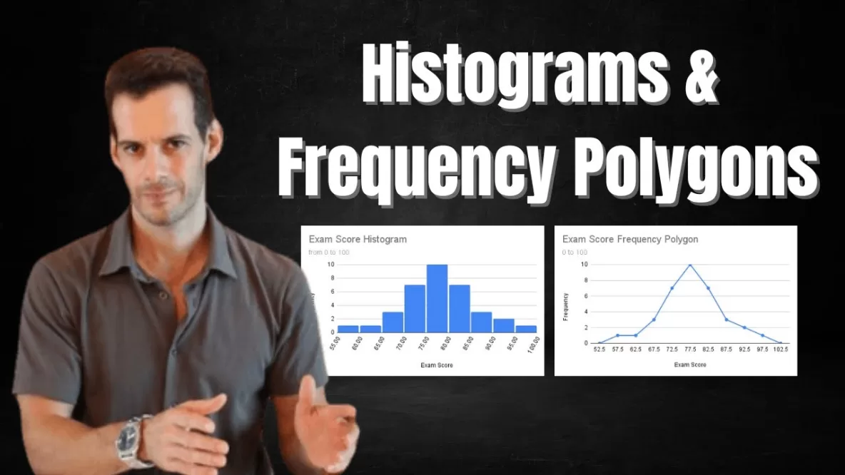
So let’s look at the histogram that I’ve generated for this set of data. Here we can see that we have a bin size of 5, so each bin here, this one goes from 55 to 60, 60 to 65, 65 to 70. Ok, and we do have some tiny spaces between them for sort of visualization purposes but the idea is a score can fall anywhere on this line and it will end up in one of the bits and then the frequency in those bins is shown on the y-axis here. Ok, so looking at this we can sort of get a sense of how the scores are distributed across this range on the x-axis.
Now I’m doing this in Google Sheets because an interesting thing you can do here is just play with the bin size very easily. So if we go to edit our chart here and then we go here, we can see we have the chart type we’ve selected is a histogram, and if we go to customize and then we go to histogram we can just change our bin size, or in this case our bucket size. So if we were to use a bucket size of 1 we could see the histogram looks quite different. Now generally we don’t use a bucket size this small, a bucket size of 1, or bin size of 1, isn’t necessarily all that useful for a lot of types of data and often if you’re going to have a very large range it means you’ll have many bars in your histogram, maybe too many. But here we can see you know it’s sort of telling us the individual scores we can see we have a score here at 62 we had one score there at 75 we had five scores you know at 81, we had 3 scores.
So we’re sort of getting a sense of the distribution and then as we change the bucket size we can see we’re sort of smoothing things out a little bit, right? We’re grouping some scores together. We’re sort of saying well, you know, a 73 and a 74 those are basically the same score. So we’ll just put them together, or a 75 and a 76. And we might say well actually maybe we want a larger size than that. Maybe we say that okay well the range from, you know, 65 to 70 that’s basically the same score. From 70 to 75 we’ll say that’s basically the same score. And so here we’re using this bin size of 5 and we see this sort of smooth depiction of the distribution of these scores. And in this case it is resembling a normal distribution, which is a distribution that we’re going to talk about in a lot of detail in the future.
Ok, so one of the issues we have with the histogram is that we do still have these sort of jumps between the bars. We might say these might be a little bit misleading, depending on our score range and depending on our frequencies. so here we might say well if a score of 73 is basically the same as a score of 74, you know, but a 74, you know, isn’t that basically the same as a 75, you know? But we have this sort of sudden jump in the bar and that’s because we’re depicting it with these bars here and so we might say that maybe we want to avoid that.
One way to avoid that is to create what’s called a frequency polygon. And so in a frequency polygon we’re going to eliminate these sudden sort of sharp 90-degree angle jumps that we have in the bars. And the way that we’re going to do that is instead of using bars we’re going to put a point at the midpoint of each bin. So we’re going to have a point here at 57.5 and we’re going to have a point at 62.5, and that point is going to be on the y-axis at the frequency for that bar. So instead of bars we’re going to have a series of points that will located at the midpoints of these Bars and then we’re just going to connect those in a line. So now we have a line showing us the overall shape of our distribution and if we go down here we can see that I’ve done that.
Now this is a little bit more complicated to create, you do have to create some additional columns where you identify the midpoint labels that you want to use, and you have to calculate the frequency for your different bins in a column, they don’t have a chart that will automatically generate those for you. But here we can see that this is essentially telling us the same thing the histogram told us, but it’s avoiding those sharp jumps in the bars.
Now the only other difference here when you’re creating a frequency polygon is that you’ll notice that I extended to the bins below and above the range of my data. So I have a bin here from 50 to 55 with a midpoint at 52.5 even though I didn’t have any scores there. And I have a bin here from 100 to 105 with a midpoint at 102.5 even though I didn’t have any scores there. The reason that I extended to those two more bins is that I want to have my line come back to 0 on the y-axis. I want to close off my polygon, right? If I just end at the last bin I have data for then this is going to be sort of hanging in the air, right, leaving this part open. So we want to close off our polygon and the way we do that is just by extending to a bin on either side of the range of our scores. And so here we can see we have this same summary of this fairly normally distributed set of data.
So now that we know how to create a histogram or a frequency polygon for a set of scores, you might wonder why do we do this. What’s really the point of getting a sense of the shape of our distribution of scores? Well what we’re really trying to do is we’re trying to compare to a known distribution. That is a distribution that we can describe with a formula and for which we can calculate precise probabilities. Now the most common of these that we’ll use is a normal distribution or a normal curve or a bell curve, and that’s sort of an idealized perfectly distributed set of scores for which we can calculate the probability of every single score. And what we want to do is see if our sample is similar enough to this known distribution. Now this is not the only one and we will see others but it’s a very common one. It’s very commonly assumed that many variables are normally distributed and so when we look at our sample we want to see, does this approximate a normal distribution?
And the reason that’s important is because we’re going to assume that the population follows a normal distribution. If the population follows a normal distribution, or approximates one, and we know the parameters of the population, or at least we have good estimates of the parameters based on the sample, then now we can take those population parameter estimates and we could take the shape of the known normal curve, which is sort of the perfect idealized form, and we can use the parameters and then we can calculate the precise probabilities for all of our different scores for that variable. And then what that allows us to do is to go back to our sample and think about, what’s the probability of getting a sample like this if the population looks like this? What’s the probability that this sample came from this population or is it more likely that it actually came from a different population, right?
So this is sort of the basis of some of the statistical analyses that we’re going to be doing later. But it all starts with sort of getting a sense of the distribution of scores that we have and seeing if it’s similar enough to a known distribution that we can make these assumptions. We can make these comparisons and then we can start estimating probabilities. So that’s the basic idea of histograms and frequency polygons and what they’re useful for in sort of the general process of thinking about how our set of scores might resemble a known distribution. I hope you found this helpful. If so let me know in the comments, ask any questions that you have and I’ll try my best to answer them, make sure to like and subscribe, and also check out the hundreds of other psychology tutorials that I have on the channel. Thanks for watching!