In this video I explain frequency distribution tables and grouped frequency distribution tables for summarizing data. I explain each of the columns, including the variable measured, the frequency, the proportion and percentage of the data at each variable, and the cumulative frequency of scores. I also discuss choosing a class interval for a grouped frequency distribution and the difference between apparent and real limits for class intervals or class boundaries. Next I consider how we can use a grouped frequency distribution table to estimate the mean, variance, and standard deviation by reconstructing a version of the raw data based on the midpoints of the class interval.
Video Transcript
Hi, I’m Michael Corayer and this is Psych Exam Review. A frequency distribution table shows us a summary of our data and it shows us the possible values of X in ascending order and then in the next column it shows us the frequency of those scores. So our first column will be labeled with the variable that we’ve measured, X, and the second column will be labeled frequency, or F, for how frequent each of those values were in our sample. So by reading across a row we can see the value for x and then how many of those scores we had. Now generally this means that we’re going to need to have a row for each of the possible values of X although we’ll see that there are some exceptions to this.
If we have a small range of scores then we can include a row for every possible value of X but we don’t need to include values that go beyond the range of our sample. So we can start with our lowest score and continue until we get to our highest score, we don’t need to include the values beyond this. But we do need to clearly label on the table that those values were possible. So in this example we can see that the possible values for X range from 1 to 10 and that’s clearly labeled, but we start at 3 and continue up to 8. We don’t need to include rows for 1 and 2 or 9 and 10 because the reader can infer that these had a frequency of 0.
For values of X that didn’t occur in the middle of our range we still want to include a row and indicate that the frequency was 0. We want to have a smooth transition from our lowest to our highest score without any gaps, even if there were gaps in our sample. So in this example we can see that we still include a row for 5 even though we didn’t have any scores of 5 in our sample. So we’re starting with our lowest score, including a row for every possible value of x until we get to our highest score, and this means that the number of rows that we’ll need will be the range plus 1, and that’s because it’s inclusive of the highest and lowest score. So in this example we can see that we had a range of 5 and that means we’ll need 6 rows in order to present all of those possible values of X.
From this table we can figure out a few things about our sample. The first thing we can do is figure out how many scores we actually had in our sample. So all we have to do to find this is find Sigma F; that’s the sum of all the frequencies. If we add up the frequencies of all the scores then this will give us the n that we had for the sample. And in this case we had an n of 10.
Now we can also find the mean or X-bar and we can do this by adding up all the values of X and dividing by n. But we have to remember that we have to add up each value of x each time that it occurred in the sample. And so to get that what we’re going to do is multiply the value for X times how frequent it was, and then if we add all of those up and divide by n. We’ll see in this case we get an X bar of 5.8. In addition to having columns for the possible values of X and the frequency of those values, we could include some other information in the table.
One thing we might include is the proportion of data found at each value of X and so we’d find this by taking the frequency at each value of X and dividing it by n. So now we’d have a column telling us the proportion of scores that were found for each value of X and this column should add up to 1, or very close if we had some rounding. We could also represent the proportion as a percentage and we do this by multiplying this value times 100. So now we’d have the percentage of data from our sample that was found at each value of X and this column should total to 100 percent.
We could also have a column that shows the cumulative frequency of scores and so we could do this either by just summing up the frequency values and so we can say at this point we have a total of three scores, at this point we have a total of six scores, etc. Or we could do this by summing the percentages. So this would be saying, you know, at this point we’ve reached 30% of our data or at this value for X we’ve reached 60% of our data. This gives us a sense of the distribution because we can see how quickly those frequency scores are accumulating. So we can see if there’s a lot of data in the lower or upper halves. We could also use it to find the median, which would be whatever value is going to bring us to 50% of our data.
With a small range of scores we’re able to present all the possible values for X in one table but as we get more and more possible values for X this becomes unwieldy. Once we have more than about 15 possible values for X our table is just getting too long. It’s becoming too difficult to read and so in this case we might decide that we want to use a grouped frequency distribution table.
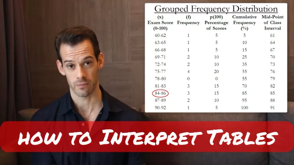
Let’s say that we had a sample of exam scores and they range from 61 up to 92. So that’s a range of 31 and that means we need to have 32 rows in our table in order to present each possible value for X. This is impractical. So what we’re going to do is we’re going to group scores together into what are called bands or class intervals, then each class interval will have a row in the table but that will represent multiple possible scores for X rather than each individual value.
For ease of reading, a frequency distribution table should probably have somewhere between 5 and 15 rows. So a good rule of thumb is to aim for about 10 rows in your table. So now we have to determine how can we take the full range of our sample here and condense it to be about 10 rows in our table.
To divide your data into class intervals you can take your range plus 1 and then divide it by a possible width of your class interval and then round this up to the nearest whole number and that will tell you how many rows you need. So if we had a class interval of 2 here then we’d need 16 rows, which is still a bit high. If we had a class interval of three then we’d need 11 rows. Larger class intervals mean that we need fewer rows, but we’re sacrificing some of the detail about our sample. So there’s a trade-off between the readability of our frequency distribution table and how much information it’s providing about our sample. For example, we could choose a class interval of 10 here and then we’d only need four rows but we might start thinking that we’re grouping scores together that maybe shouldn’t be grouped together. So if we had a class interval of 10 then we might start thinking that the difference between a score of 70 and 79 is fairly large and so we probably shouldn’t be treating those scores as if they’re the same.
In addition to the number of rows there’s a few other guidelines that we want to keep in mind when we’re choosing our class intervals. The first is to try to choose simple whole numbers whenever you can so you want to avoid having a class interval like 70.2 to 72.6 or something like this. You also want to make sure that the bottom value of each class interval is a multiple of the class interval. This means that we aren’t necessarily going to start our first class interval with the lowest score in our sample. Instead we’re going to start the first class interval with the lowest multiple of the class interval that’s closest to our lowest score. Finally we want to make sure that there’s no gaps or overlaps in our class intervals. So just like before we want to make sure we have a smooth transition from the lowest value of X to the highest value of X in our sample and this means that we’ll include a row for a class interval even if as a frequency of 0.
So let’s try using a class interval of 3 with our data. Our lowest score is 61 but we don’t necessarily want to start with 61 because it’s not a multiple of 3. We want to start with the nearest multiple of 3 and so that would be 60. And then we’re going to have three scores there, so that’s going to be 60, 61, 62, and then our next class interval will start at 63, which is also a multiple of 3. And so we continue in this fashion until we get to the class interval that includes our highest score which would be the one from 90 to 92.
Now we can count the frequency of scores that fall in each interval to create the frequency column. Now as we do this you might realize that I’ve included some fractional scores here. So we have some scores that seem to fall between some of our intervals. We have scores like 68.75 or 74.25. So how do we go about handling these?
This brings us to the difference between real and apparent limits of our class intervals. So if we look at one of the class intervals here like the one that starts at 72, that’s the apparent lower limit but the real lower limit is actually 71.5. And this class interval actually extends up to 74.5 and then the next class interval that appears to start at 75 would actually start at 74.5. And so this allows us to smoothly transition between all of our class intervals even if we have fractional data. And so when we look at this interval it has apparent limits of 72 to 74 but it has real limits of 71.5 to 74.5. These can also be called class boundaries. With this in mind we can now fill in the frequency column for our sample set of data and then we can go ahead and create a percentage column and we’ll also create one for the cumulative frequency as a percentage.
So now we have our completed table and we can see this idea that a grouped frequency distribution table simplifies our data, makes it a little bit lower resolution, and we can see this if we try to find something like the mean. What we realize is we can no longer recreate the actual raw data because our scores have been grouped and so we no longer know their individual values. All we can do now is estimate for the mean. We do this by assuming that each individual score is just located at the midpoint of its class interval. So if we look at this class interval here we just assume that all three scores are 85. Now in reality 2 were 84 and one was 86, but if all we have is the table we don’t necessarily know that. So we make this assumption and on average we’ll be pretty close. And if we wanted we could add a column to our distribution table and show the midpoint values for each of these intervals.
Using the midpoint for the class intervals allows us to estimate the scores and sort of reconstruct what the data set might have looked like, but it won’t be exactly the same as the actual raw data. And as the class interval gets larger and larger this estimate will get less and less precise. So we could estimate X-bar by multiplying the midpoint times the frequency of scores in that class interval and then adding those up and dividing by n. And we could even do things like estimate the variance. So we’d take this estimated X-bar and then we’d compare it to all of the individual midpoint scores and that would give us a deviation, which we could square, then sum those deviations up and divide by n-1 in order to get an estimate of the variance. And if we took the square root of that we’d have an estimate of the standard deviation.
We’ve lost the detail that we need to calculate these precisely and in most cases those values will appear in other tables or other charts. But in the case that we only had the grouped frequency distribution table we would have a way to estimate these, although our estimate will be influenced by how large the class interval was.
I’d highly recommend that you practice making a few grouped frequency distribution tables. You could use the data here and try a different class interval or you could just make up some of your own data then you can practice a few different calculations to see how the class interval influences things like the estimates of X-bar or the variance and hopefully this will give you a better appreciation for the decisions that are made in a grouped frequency distribution, especially choosing the class interval and how that might influence how the data is summarized and presented.
I hope you found this helpful, if so, let me know in the comments, ask other questions that you might have, like and subscribe, and make sure to check out the hundreds of other psychology tutorials that I have on the channel. Thanks for watching!